Global Creation Foundation Gets a New Dashboard
UI/UX Designer
3 PM
5 Designers
14 Developers
Nov 2025 - June 2026
Dashboard Design
Developer Handoff
Problem
The music programs scaled globally but the system couldn’t keep up.
Global Creation Foundation runs multiple programs around the world teaching students how to play instruments. They found that keeping track of all their resources, contacts, and program statistics grew in difficulty. With plans to continue expanding their reach, they knew their current practices weren’t sustainable.
Communication is fragmented on across WhatsApp chats and it’s difficult to keep track of the primary languages for each program when creating translated music lessons.
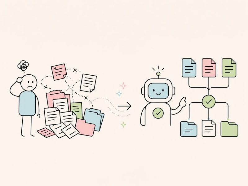
Resource tracking was managed in shared Google Sheets with no way to filter by program, leaving directors overwhelmed with data irrelevant to their scope.

As GCF scaled globally, their operations couldn’t keep up. The organization lacked a leadership hierarchy to delegate program oversight.
Research
Thinking through the systems.
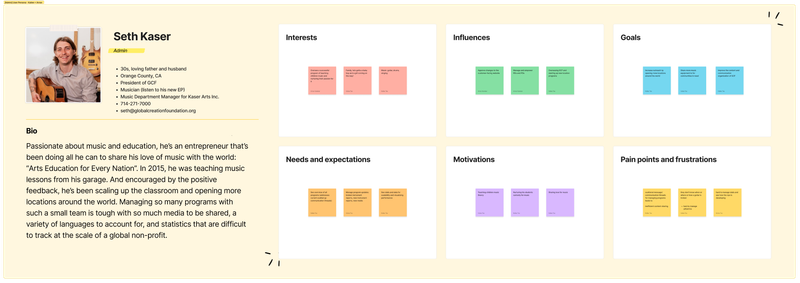
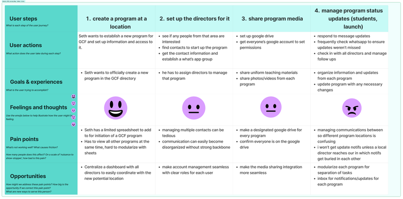
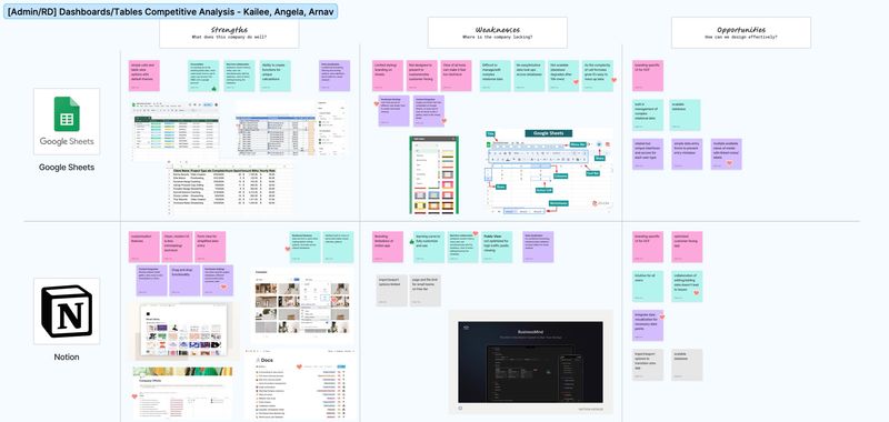
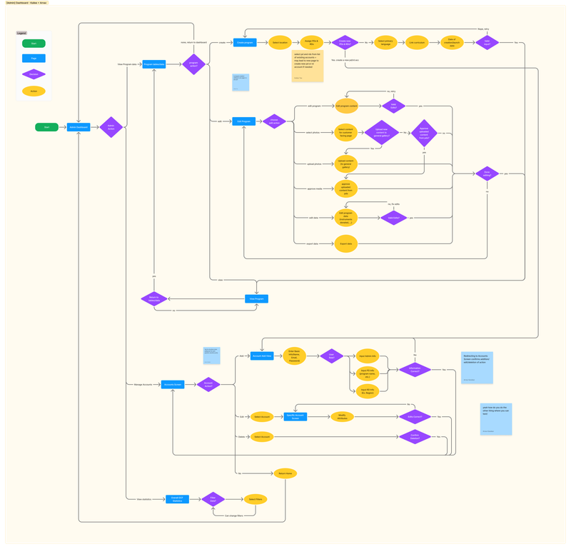
I created a user persona for the Admin type user to understand how to best streamline the different actions he has to take to manage this non-profit. Conducting a competitive analysis gave my guidance on how to structure information. The user flow helped me to consider all actions the user must be access and where they must make decisions.
Solution
One centralized, role aware system to keep up with it’s expansion.
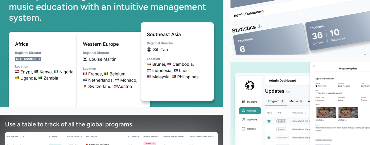
GCF needed a centralized, role-aware system to manage its growing complexity. On my team, I designed the Admin Dashboard and collaborated on the Regional Dashboard because there were many page similarities.
Allow a birds-eye view of GCF’s global impact to support program management.
Enables admin controls limited to a specific region.
Allows directors to access curriculum and input program updates, such as number of donations and students.
Automatically derives statistics from our database to show the impact.
Features
Enhancing their current system of overseeing all programs.
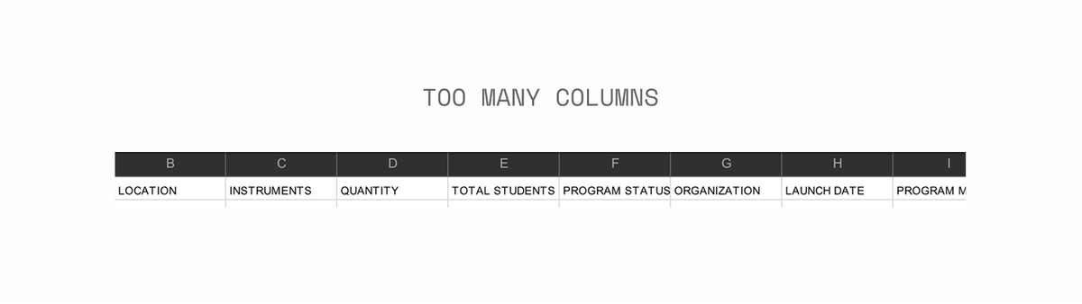
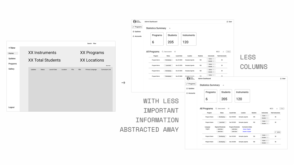
Instead of relying on their google sheets spreadsheet, the client needed a way to easily scan through programs and prevent making accidental edits. My initial thought was to keep all the columns the same as their spreadsheet, but the client wanted more columns that required in awkward horizontal scrolled.
Since the new columns weren’t too high in the information hierarchy, I chose an expanding/collapsing drawer design that opens when the user hovers over it. Considering the device the client wanted to use it on was only a computer, this worked out perfectly as it allows easier access to program data than a combination of horizontal and vertical scrolling.
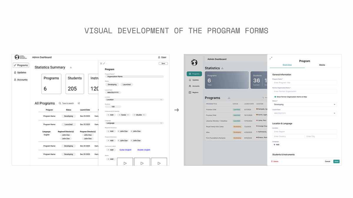
This side drawer was used to prevent inline editing access that was frustrating on Google Sheets and allow for more detailed instructions to complete each field.
Categorizing Updates for smoother management
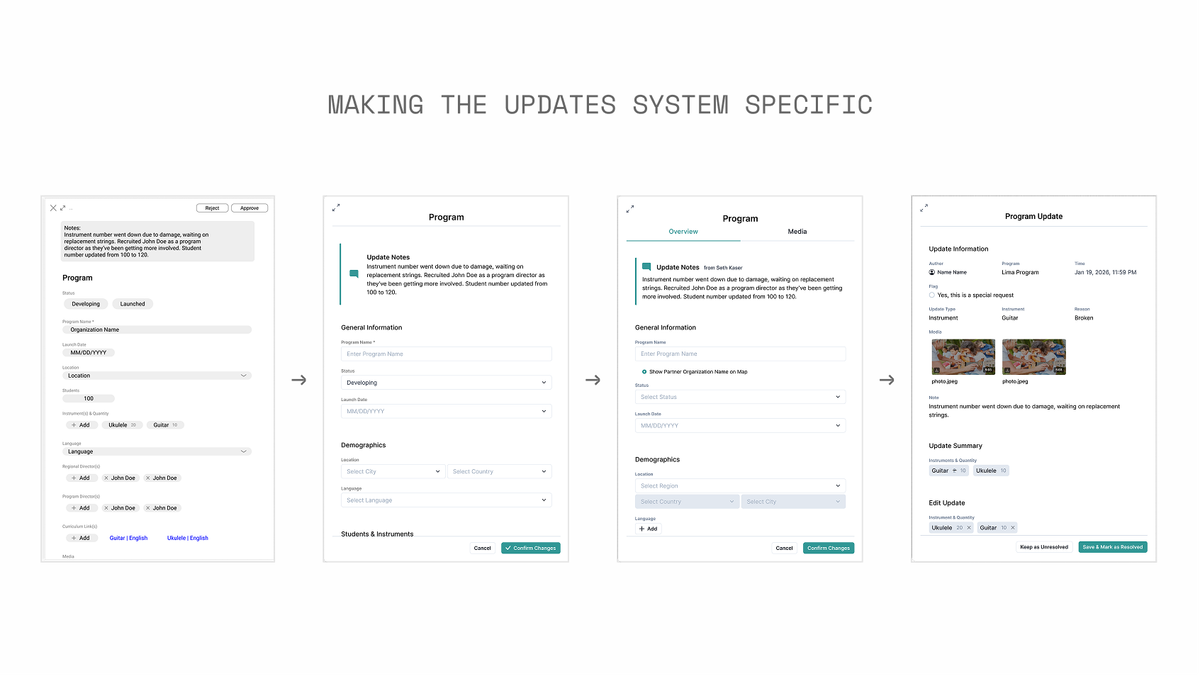
The current system for updates was spread across different communication platforms like whats app and email and the user needed a centralized way to track student head count, instrument issues, and program development updates.
This initial system made it difficult for the user to sort through different types of updates quickly so I introduced tabs to offload the initial, primary use of filters.
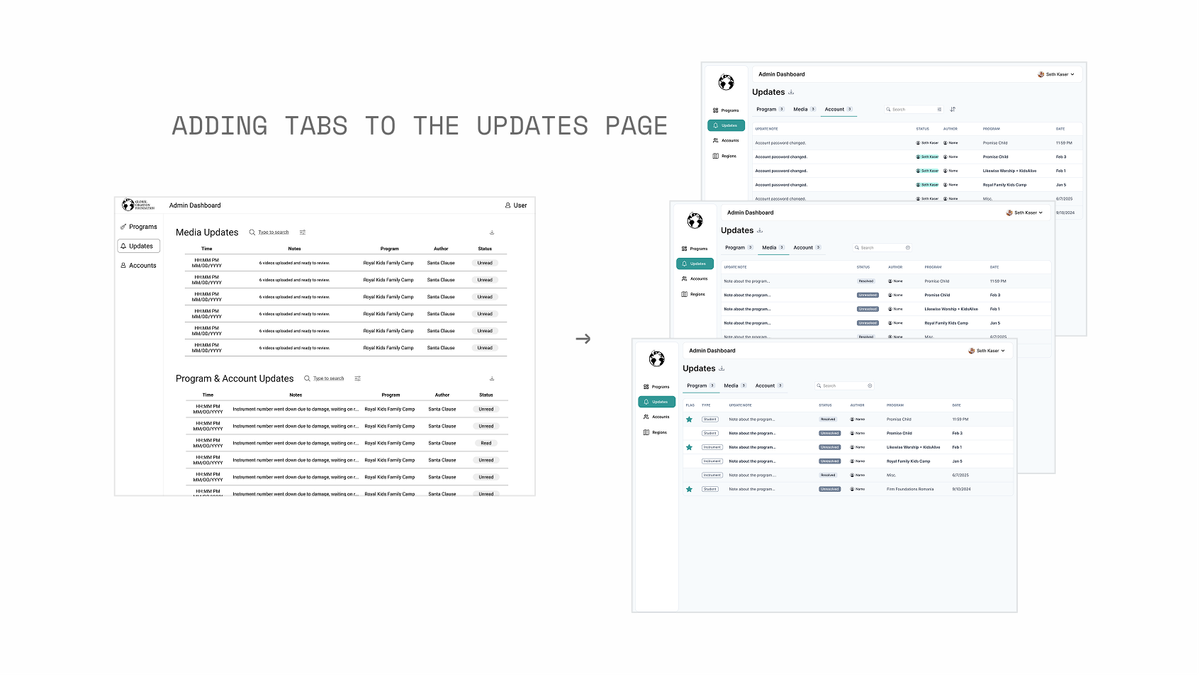
This initial system also categorized all updates to be summarized into one note section. I then created a new form that was unique to the different types of updates.
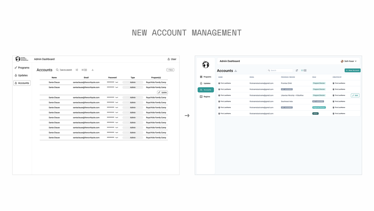
Admins can now track all user Accounts
Since the system of communication was standardized, the admin wanted to be able to add peoples accounts to access the program they would be assigned to easily.
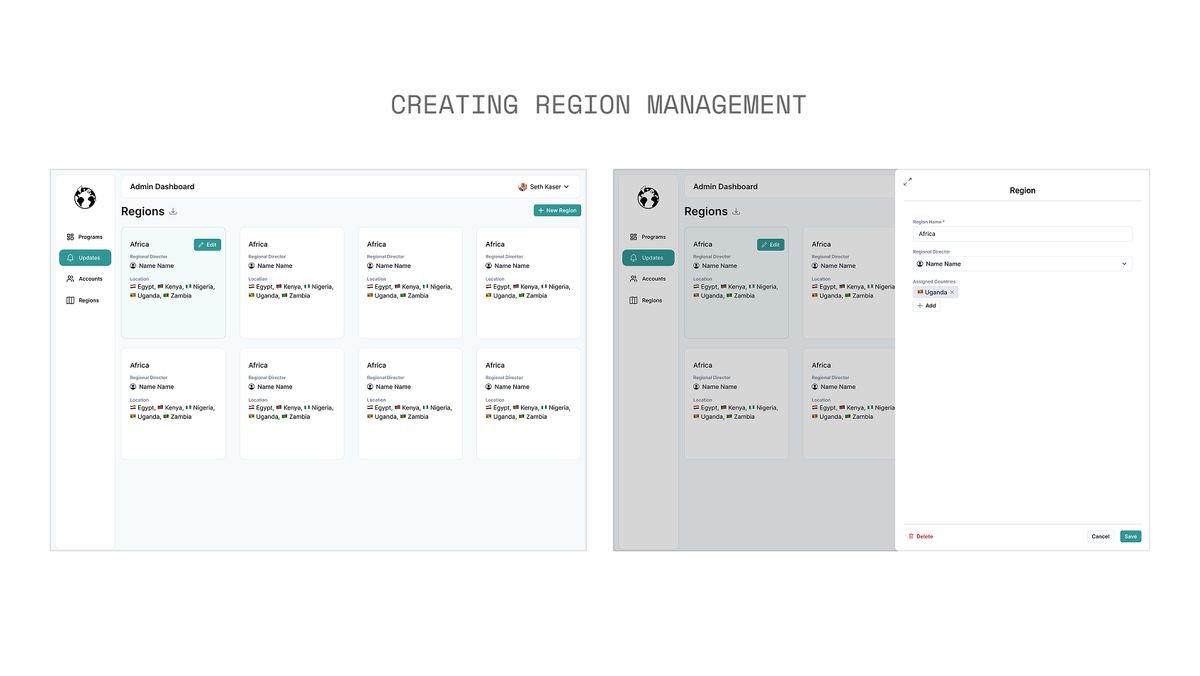
Introducing a Region Dashboard for Admin Use
This page was not in any initial vision for the product, but I proposed it to make program region management better for admins. This page was difficult to develop because the use type of Regional Director was still in the process of being added to the organizational hierarchy of GCF and so it took a lot of time for me to think through practical user flows and roadbumps that could potentially come up. The original system made it so that every program that existed in a region would have to be individually assigned to that person. I proposed that instead, programs should be added to a region and then that region could be assigned to a person. This extra layer of abstraction simplifies the process and also organizes the information in a way that’s easier to scan. That way the programs the regional director is in charge is automatically assigned in its region group.
Reflection
With more ownership than I’ve had before in previous projects, I found myself feeling responsible for my pages’ perfection. I would revisit the same pages week after week with new iterations to improve the user flow. This taught me that there is always something to improve, even when people think it’s done.
We had the opportunity to have 2 usability testing sessions with the CEO of GCF, and these interactions helped me to empathize deeper with this product’s future user. I was reminded to keep in mind that these users could be from around the globe and that I need to be considerate of online web patterns that could be translated.