ZotMeet gets a Makeover
UI/UX Designer
Marketing
3 PMs
2 Designers
8 Developers
Nov 2025-Present
Mobile Design
Product
Strategy
Problem
Scheduling meetings shouldn’t be this hard.
When my peers need a meeting for a student organization, they have to sync across 5+ google calendars, painfully fat finger through a difficult mobile UI, wait for responses, and then search each building’s website for an availability that matches…

The experience is frustrating and there is not one place that handles it all.
Solution
On ZotMeet, a student-built web-app, they can…
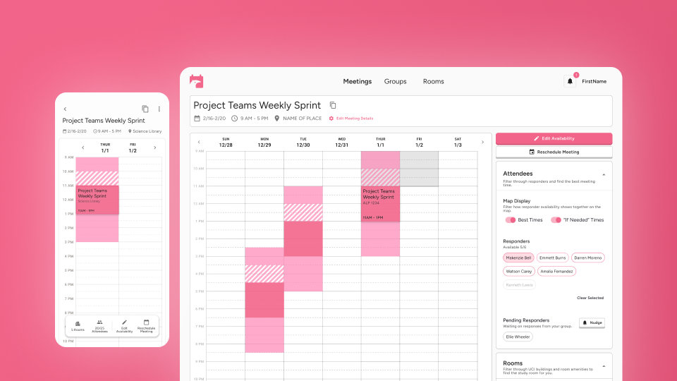
auto-sync their google calendars, send reminder notifications to their group, and get in-app room suggestions based on the team’s best availability.

With ZotMeet, all the annoying hard stuff is handled for them in one place.
Rebranding
Stakeholders wanted a branding to align with their parent organization.
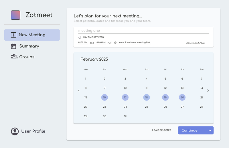
I led a major rebranding of the MVP website to align its current design with ICS Student Council’s existing pink logo.

My PMs also asked to make the user interface a balance between something playful and professional using React’s Material Design Library.
For the logo specifically, I iterated 28 variations to incorporate UC Irvine’s mascot, an anteater, with the calendar icon.
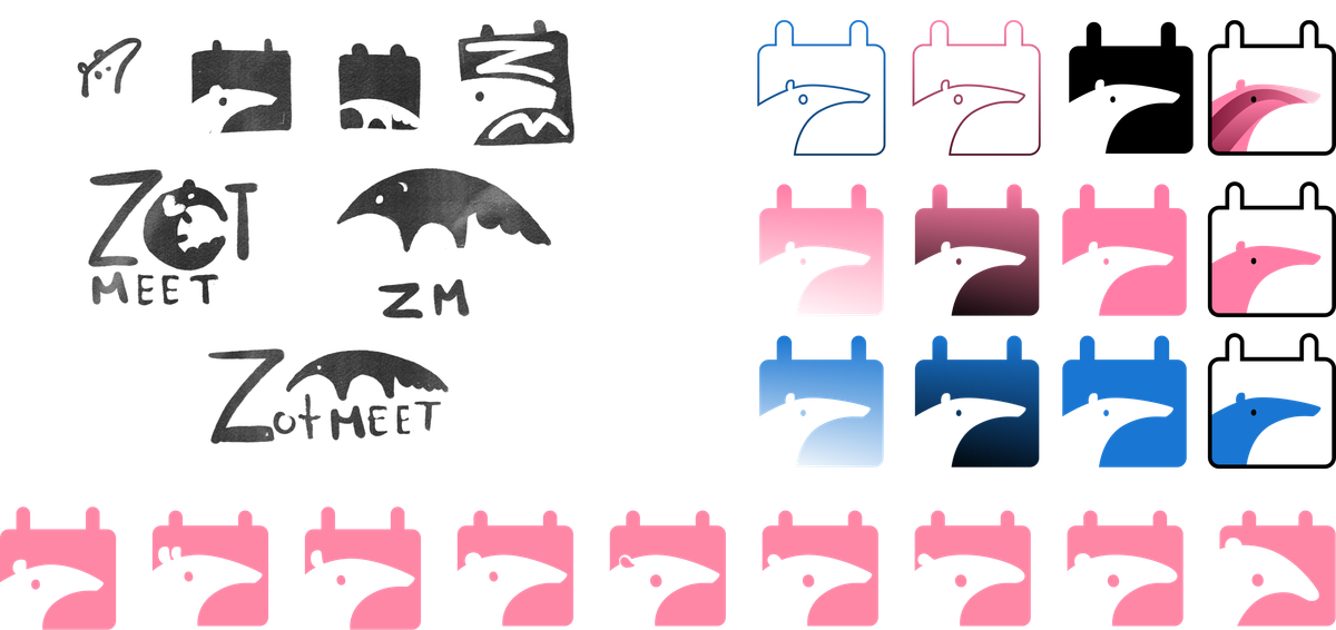
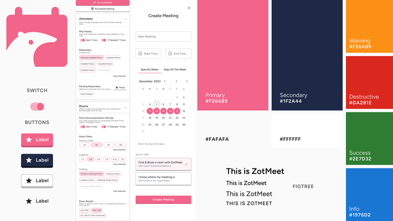
The new branding strikes this balance between playful and professional, using rounded 3D effects and generous white space to minimize visual load for a productivity tool.
Layout Explorations
More features, not enough space.
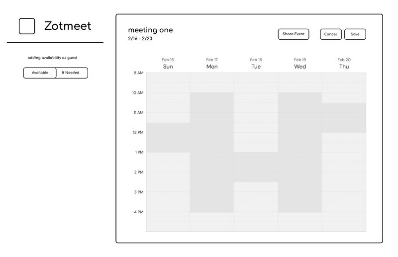
One major integration to be added onto this app was our Room Exploration. The current design only displayed the calendar and users and the developer team had big plans for new features that needed to fit somewhere on the screen.
-
Best Time: Users should be able to toggle view the best time for their meeting combining people and room availability
-
Room filters: Users should be able to choose the capacity and building their room exploration is
-
Room Availability: Users should be able to quickly search through many different rooms and view when they would be open
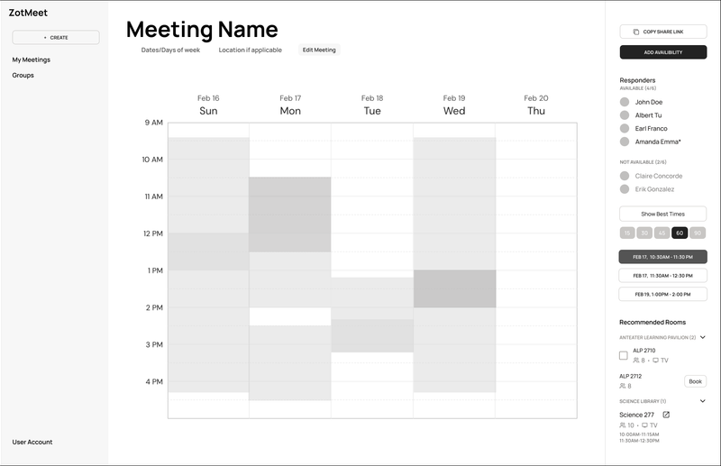
This first iteration made a right section contain everything from attendee availability and room availability.
My team liked this version but my concern was on the scalability of the right column information. During user interviews, a potential user mentioned having 50+ attendees fill out their availability on their previous tool and having to scroll through the entire bar didn’t seem productive and would bury the other features contained on the right sidebar.
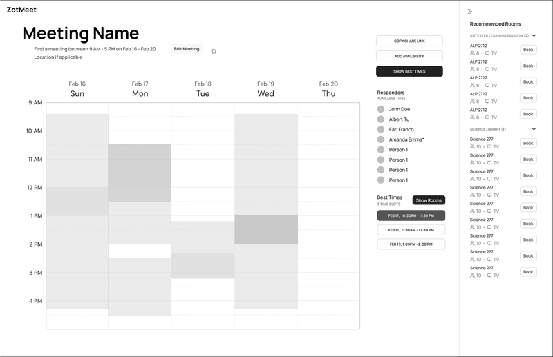
I then explored a version that gave more separability between person availability and room availability. Removing the left nav bar was also done to help save on horizontal space. Although it helped to organize the space better, this version felt too distracting having users and rooms next to each other.
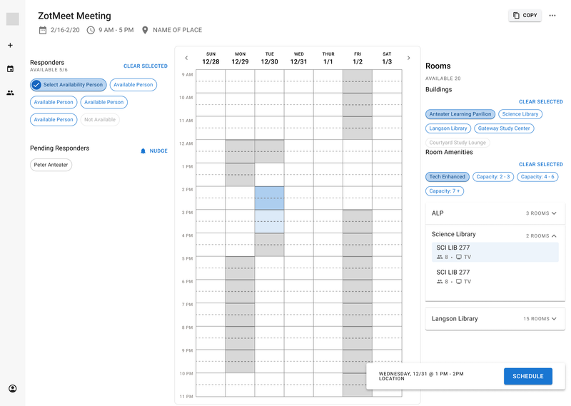
I explored this 3 column version to see if it would help reduce the visual load, but user testing revealed that having 3 columns was still very distracting and not intuitive to navigate.
At this point I also started exploring the Material Design library and how its components could fit together to meet the requirements.
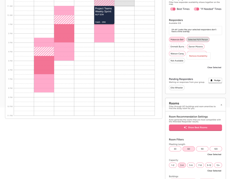
All iterations helped to reveal how the systems that I think in aren’t universal, and user testing couldn’t validate separating the person and room availability. Each user preferenced scrolling over clicking to expand a new section, so I went back to the first iteration and enhanced it with collapsing sections.
If-Needed Innovation
Innovating How “If-Needed” Time is Displayed
I wanted it to be easier for meeting schedulers to identify an if-needed block without having to remember to check if there are even any if-needed times.
Competing products use a toggle on/off to include if-needed time, but with the default being on, it’s easy to forget to check if you have to consider an if-needed time block.
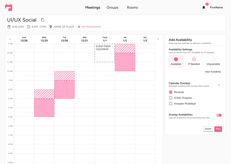
With this new diagonal pattern with transparent stripes, a meeting scheduler can visually identify an if-needed block with ease despite layered availability.
Mobile View
Optimizing for Mobile Responsiveness
Without mobile versions of each screen, I used this as an opportunity to optimize our mobile UI, researching conventions and iterating toward a cleaner solution using floating islands and drawers instead of the sticky scroll elements our competitors rely on.
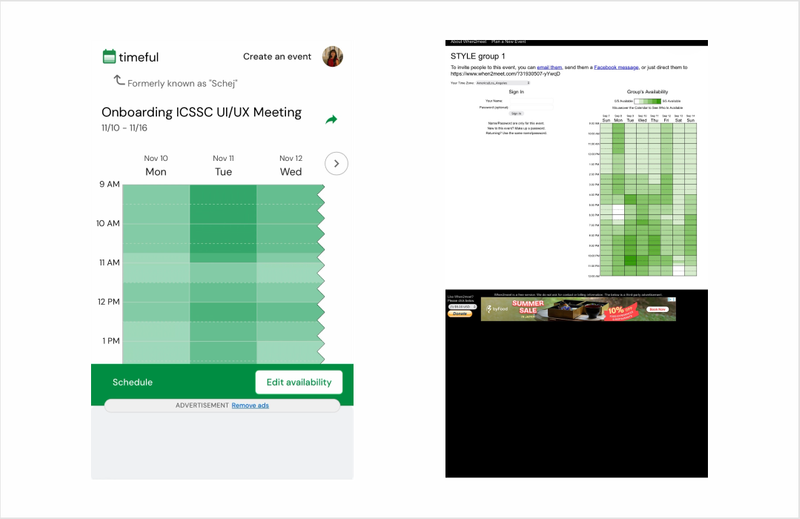
Our key competitors either aren’t optimized for mobile or are paywalled, leaving the free version cluttered with ads that made the already tedious process of adding availability on mobile even harder. Our target audience are college age young adults who are most likely to use this app on their phone. This made mobile responsiveness a high priority for our team.
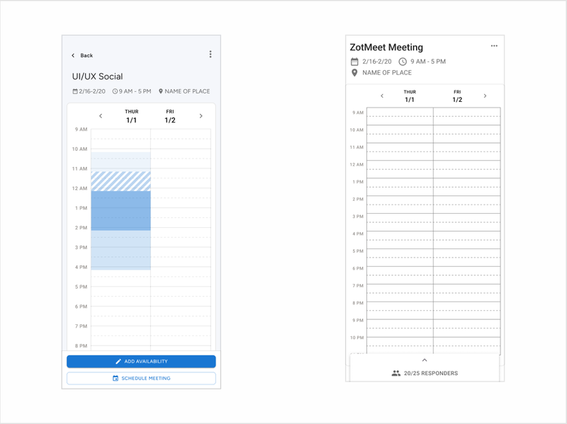
While these designs were simple, they didn’t provide the breadth of features we offer on the desktop version easily accessible.
-
Display number of responders available for a given time block
-
Display number of rooms available for a given time block
-
Access to “add/edit availability” button
-
Access to “schedule meeting” button
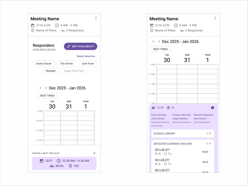
This version used a collapsible drawer that expanded to show person and location availability. However this would make it difficult to click on persons as a filter with the buttons being too small, and it also didn’t support large scale meetings with high attendance where the user would run into the same scrolling issue.
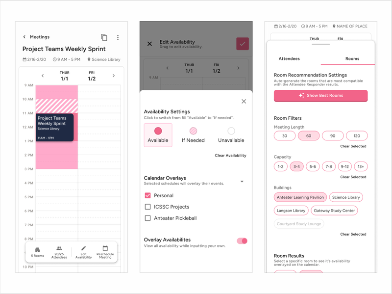
I introduced tabs to organize attendance from room availability to solve the original issue so the attendance could easily scale.
The floating navigation bar also includes the desktop shortcuts of editing availability and scheduling a meeting, and this is how I was able to balance accessibility of tools without compromising on screen space.
Final Product
This project is shipped and available for use for anyone who signs up.
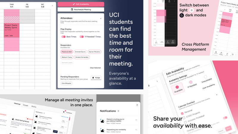
As a designer, it’s a lot of work to collaborate with developers, but I’m so grateful to my team and for making my visions come to life!
Download it from the App Store!Reflections
Working with React MUI for the first time was a steep learning curve, but customizing its components ultimately deepened my understanding of good design system practices that I have implemented in my own project organization systems.
Adapting to 3 different PMs and their varying priorities was initially challenging, but it pushed me to develop clearer communication and stronger upward management skills. I’ve loved every second of this project and can’t wait to see how we grow with it.